Starting fresh

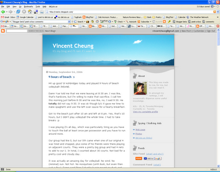
Before

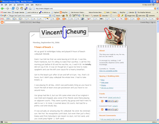
After
In several respects, I'm starting fresh back here in Toronto. My blog now reflects this with a brand spanking new redesign, which has been a long time coming.
The layout and background images are generally what I'm going to stick with, but there will be some minor cosmetic changes in the next little while. I only realized when redesigning my blog that it looked like crap on IE, but you should be using Firefox anyways :p.
Some of the fancy things I added (hacked) to my blog are no longer working b/c of the update to Blogger, such as the peek-a-boo comments, recent comments, and the comment feed is messed up. The random picture feature will make its reappearance in a day or two. New features of interest are the labels and the new archive display, which shows counts for the number of posts per month :p. If I get around to it, I'll go back and label my old posts (all 366+ of them).
I'm open to any comments or suggestions you have about the redesign.

5 Comments:
I like the new look. I would say its more like you then the other one. But what do I know.
I was never pleased with the old look of my blog. It was too generic and boring, and yes, it didn't really feel like me.
Looks nice. Like the paper clip effect.
I really like this design a lot. Well done!
Very clean design and reflects the fact that the blog owner is a "professional student" and also I feel that you have nicely used the controversial "Comics Sans" font from Microsoft which ironically is made by a guy by the first name Vincent! I guess it's just me who is making the connections just to make it look cool, eh? The paperclips are just perfect.
Post a Comment